|
Hal Shelton Revisted: Designing and Producing Natural-Color Maps with Satellite Land Cover Data Tom Patterson, US National Park
Service PREVIOUS: MODIS VEGETATION CONTINUOUS FIELDS |
DESIGN
AND PRODUCTION TIPS
This last section provides design and production tips for making
natural-color maps and managing land cover data. Because of space
limitations and the ever-changing nature of software, the intent of
Photoshop tips described here is to give you design ideas and point you
in the right procedural direction. The downloads area for this article contains
additional resources related to the discussed tips. Prior experience
with Adobe Photoshop is helpful. And given the large files involved, so
too is a graphics workstation with large amounts of physical RAM,
scratch disk space, and file storage.
Figure 17. Shaded relief merged with a
natural-color base made from
MODIS VCF data.
Tip 1: Combining shaded relief and land cover data
Shaded relief is an essential component on all natural-color maps (Figure 17). However, the textures in shaded relief
and those found in land cover, if clumsily combined, have the potential
to become heavy and messy. The following will help you use shaded
relief more effectively with land cover data:
- Show shaded
relief and land cover with roughly equal emphasis. Despite the
considerable effort that goes into transforming raw land cover data
into a natural-color base, for the greater graphical good, do not to
print these colors too boldly. The same rule applies to shaded relief.
The relative visual prominence of shaded relief and land cover varies
on a map depending on viewing distance. Up close the shaded relief
appears more dominant as a dimensional texture. By comparison, when
viewed from farther away land cover colors on the map become the more
noticeable feature, appearing as broad generalized zones.
- Generalize
shaded relief at reduced scales. Although land cover colors reduce to
smaller sizes with no visible harm, shaded relief is not as elastic.
Excessive topographic detail at small map scales only pollutes the
background land-cover colors and detracts from our understanding of
major topographic structures. Repurposing a natural-color map from, for
instance, wall map size to textbook size requires replacing the shaded
relief with a more generalized version. As a general rule the
resolution of a DEM used to generate shaded relief should be equal to
or less than that of the land cover. For example, if a land cover image
is 10,000 pixels wide, the DEM used to generate the shaded relief might
be 7,000 pixels wide. The resulting shaded relief is then upsampled (or
rendered) to 10,000 pixels wide for final compositing with the land
cover. The need for generalized shaded relief applies to all maps and
not just those with natural colors.
- Remove shaded
relief tones from flat areas. A typical shaded relief contains tonal
values of 10 to 20 percent density in flat lowland areas. They serve as
a neutral base upon which other topographic features, modeled by light
and shadows, project upward or downward in a three-dimensional manner.
While tones in flat areas are desirable for stand-alone shaded relief,
the overall image becomes too dark when merged with land cover colors.
A cleaner and brighter alternative is to let the land cover colors
themselves do double duty as a base tone for the shaded relief. To do
this use Curves (Image/Adjustments/Curves) or Levels
(Image/Adjustments/Levels) to clip the tonal range of the shaded relief
just enough to remove tones from the flat areas. This procedure works
best with a shaded relief possessing a full tonal range including fine
detail in the brightest highlighted slopes and densest shadowed slopes.
Be careful not to remove too much tone, or the shaded relief will lack
body and appear spindly. Using the Eyedropper tool and the Info palette
permits the removal of tones with numerical precision.
- Show
illumination. The illuminated slopes on a shaded relief are almost as
important as shadowed slopes. They enhance the apparent three
dimensionality of a shaded relief, giving it an embossed look and also
lightening the image. To add supplemental illumination to a shaded
relief, first create a Hue/Saturation adjustment layer (Layer/New
Adjustment Layer/Hue/Saturation). Next, copy and paste the grayscale
shaded relief into the adjustment layer’s layer mask. Then, in the
layer mask, use Curves to choke the shaded relief tonal range so that
all areas except illuminated slopes are black. For the final step
double click on the adjustment layer icon to open the Hue/Saturation
dialog and move the Lightness slider to the right until the illuminated
slopes look appropriately bright. In Figure 16, the third layer from the top shows an
illumination adjustment layer in Photoshop. A low-resolution version of
this file is available on the website of this paper for you to download
and examine.
The adjustment layer technique also works well for displaying shaded relief shadows. The advantage is that the darkening preserves the varying colors below. For example, forest green becomes a darker green, desert beige becomes a darker beige, and so forth. The final result is a natural-color map with more pure natural colors. Creating shadows with a Hue/Saturation adjustment layer is similar to the illumination technique described above. But this time invert the shaded relief (shadowed slopes should be lightest) and move the Lightness slider to the left (start with settings between –55 and –30).
Tip
2: Legend design
Despite Shelton’s misgivings about their usefulness, legends do play an
important role even on well-designed maps. Readers expect to find
legends on maps, and cartographers are partial to displaying them. If a
legend is a little redundant, that is a lesser problem than having no
legend and uniformed map readers. Having said that, the design of
legends on natural-color maps is worthy of reexamination. The
traditional map legend explains natural colors with small, rectangular
color filled boxes arranged neatly in a row and separated from one
another. Typically a black casing line bounds these boxes. Such a
portrayal disassociates the legend colors from one another and, of
greater concern, from their counterparts on the map. If the map uses
shaded relief and the legend does not, the communication disconnect is
even greater.
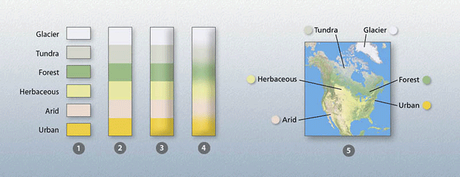
Figure 18. (1-4) Variants of the
traditional legend. (5) A natural legend. Legend portrayal becomes less
abstract and more cartographically realistic from left to right.
To improve the design of traditional legends on natural-color maps,
consider doing the following: remove the black casing lines, place the
colored boxes in a contiguous row, include shaded relief, and, perhaps,
blend the colors (Figure 18, examples 1-4).
The idea is for the legend to mimic colors on the map as closely as
possible while still maintaining order. For another step toward this
goal think about using a natural legend (Figure 18,
example 5). Placing legend labels on an icon of the map itself
communicates the meaning of colors directly and unambiguously to
readers. Compared to traditional legends, the disadvantages of natural
legends are that they require more space and are less tidy.
Tip 3: Mapping urban extents
Besides the making of natural-color maps, land cover data is a useful
product for mapping urban areas as a stand-alone category on general
maps. Isolating urban areas from the other categories in NLCD (and
other categorical land cover data) is simple to do with the Magic Wand
tool. Hint: set the tolerance to zero and do not choose the
antialiasing and contiguous options. Having selected the urban areas,
invert the selection (Selection/Inverse) and fill all of the other land
cover categories with white. The image should now look something like Figure 19 (upper left). The next potential issue is
one of generalization. Because the urban categories in NLCD include
transportation, depending on the scale of your data, discontinuous
roads and other stray pixels make for a noisy image. The Median filter
(Filter/Noise/Median) in Photoshop permits the removal of unwanted
pixels below a threshold of interest (Figure 19,
upper right). Moving the radius setting to the right increases the
amount of generalization. Be sure to apply the Median filter using
nearest neighbor interpolation (Preferences/General/Image
Interpolation) to prevent the urban colors from blurring.
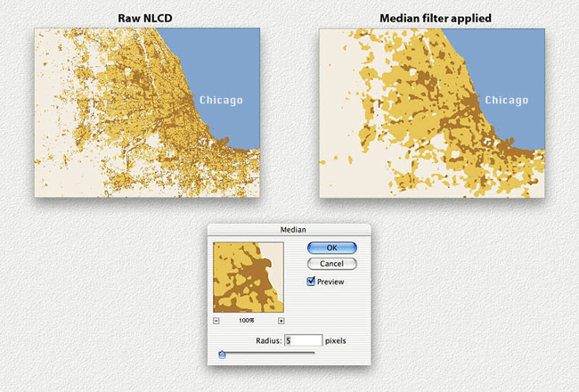
Figure 19. Using the Median filter to generalize urban land cover data.
Tip 4: Shoreline buffering
Any cartographer who has worked with data from two or more sources on the same map is familiar with the problem of misregistration, especially when merging raster images and vector linework. For example, matching raster land cover data to vector water bodies often reveals unwanted fringing pixels and data gaps—the stair-stepped pixel boundaries don’t match smooth-edged vector shapes. This problem is solved by growing the land cover pixels outward—a process called buffering in GIS applications—so that they fall under the edges of vector water bodies (Dunlavey, 2002). A similar procedure is also available in Photoshop if you know what buttons to click:
- To start,
open your land cover image in RGB or CMYK color mode and double check
that Photoshop is set to use nearest neighbor interpolation
(Preferences/General/Image Interpolation).
- Select and
delete all water pixels so they are now transparent (Figure
20, upper left).
- Duplicate the
land cover layer.
- Select the
Move tool in the Tool palette. Then on the keyboard press the up arrow
cursor once. The image will move up one pixel.
- Merge the
copied layer with original below.
- Duplicate the
merged layer and repeat steps 4 and 5. But this time nudge the copied
layer to the right.
Repeat
this process two more times, nudging the copied layer down and
then to the left respectively.
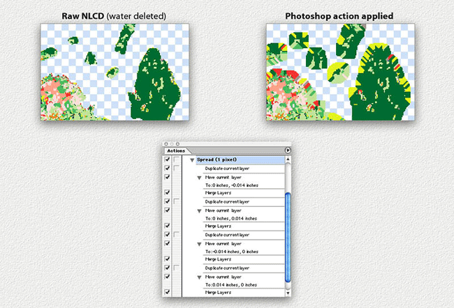
Figure 20. Using the Actions
palette in Photoshop to spread shoreline pixels outward.
Each cycle of copying, nudging, and merging the image grows edge pixels
outward by one pixel. Apply the steps repeatedly as needed until all
misregistration gaps disappear. Alternatively, record your steps in the
Actions palette and the save the results for one-click replays (Figure 20, bottom). We have built a Photoshop
droplet (the new method for transfering actions to others) that
automates this process. It is downloadable here
for both Mac and PC.
Tip 5: Land cover removal
Just because a category for land cover exists doesn’t mean that you
have to accept it. For example, the pixelized depiction of rivers and
lakes is often too noisy and irregular for display on a map, requiring
removal from the raster land cover data and showing it instead with
vector lines in a drawing software application. Beyond issues of
accuracy, considering that hundreds of thousands of pixels might be
water on a land cover image, manually replacing them with the Clone
Stamp tool is not a realistic option. The Dust & Scratches filter
offers a quicker and more accurate solution. It reads the tonal
contrast in an image and replaces pixels beyond a specified threshold
with nearby unaffected pixels. In Figure 21, for
example, the green forest color that dominates the image replaces the
black lakes. Follow these steps to remove imbedded water from an image:
- Select all
water pixels and fill them with black.
- Use the Dust
& Scratches filter (Filter/Noise/Dust & Scratches) to infill
the black-filled water bodies. (Be sure to use nearest neighbor
interpolation.) Experiment with different radius and threshold settings
until the black water bodies disappear. The settings will vary
depending on the contrast range in your image.
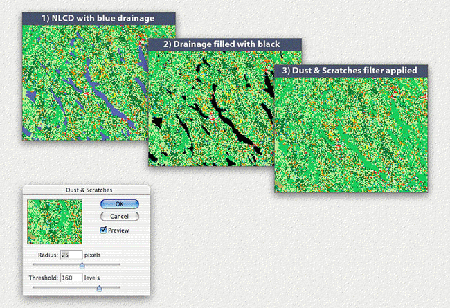
Figure 21. Removing drainages from NLCD with the Dust & Scratches filter.
|
NEXT: CONCLUSION |