Physical Map of the World
Updated: September 2015
This site offers a free map of the world with detailed 3D topography, natural environment colors, and thousands of place name labels. You can view the map interactively online or download it to disk for printing as a wall map. Two versions are available:
Click map below to open an interactive version in a new window.
ENGLISH version
Large wall map (36.3 MB) – RGB JPEG (quality level 10), 17,010 x 9,720 pixels, 270 DPI.
GERMAN version (courtesy of Stefan Räber, ETH Zürich)
Large wall map (35.7 MB) – RGB JPEG (quality level 10), 17,010 x 9,720 pixels, 270 DPI.
EXTRAS
Raster map art without labels and graticule (29.6 MB) – RGB JPEG
Editable map labels and graticule (2.9 MB) – Adobe Illustrator CS3 format
Outlined map labels and graticule (5.7 MB) – Adobe Illustrator CS3 format
Click map below to open an interactive version in a new window.
ENGLISH version
Small wall map (16.5 MB) – RGB JPEG (quality level 10), 11,520 x 6,560 pixels, 288 DPI
EXTRAS
Raster map art without labels and graticule (13.2 MB) – RGB JPEG
Editable map labels and graticule (2.2 MB) – Adobe Illustrator CS3 format
Outlined map labels and graticule (3.1 MB) – Adobe Illustrator CS3 format
The Physical Map of the World owes its inspiration to the National Geographic Society. The maps published by National Geographic during the 1960s and 70s, as the manual era drew to a spectacular close, are some of the best small-scale physical maps ever produced. Painted by artists Heinrich Berann, Tibor Tóth, and John Bonner, innovations included dramatic sea-floor topography and terrestrial environments depicted with natural colors. The resulting maps were uncommonly attractive, easy to understand, and revealed the intricate natural world to readers.
Attempts by digital cartographers to produce similar physical maps have been less than fully successful, however. Digital map art, although highly accurate, tends to have a mechanical appearance lacking the visual appeal of the best manual art. That National Geographic today still uses manual art for world physical maps indicates the existence of a quality gap. This project and the techniques discussed here attempt to raise the aesthetic level of physical world maps produced digitally.
Creating the Physical Map of the World involved the synthesis of four techniques developed over several years by the author and associates:
A unique feature of the Physical Map of the World is its projection. Rather than using a traditional projection, such as the Miller or Robinson, or the Winkel Tripel now favored by National Geographic, it uses an entirely new projection created with Flex Projector, the first-ever software for designing custom map projections. The Natural Earth projection is a pseudocylindrical projection designed specifically for presenting Natural Earth II environmental data (discussed next), from which it takes its name. The Natural Earth projection combines characteristics of the Robinson and Kavraiskiy VII projections and compares well to them in regard to map distortion.
To use the Natural Earth projection with Flex Projector, download this file (4 KB). For an in-depth look at Flex Projector software and the Natural Earth projection, refer to this article (2 MB) published in Cartographic Perspectives (CP 59, Winter 2008), the journal of the North American Cartographic Information Society (NACIS).

The Natural Earth projection applied to the Natural Earth II dataset. A distinguishing feature of the Natural Earth projection is its rounded corners (where the pole lines and lateral meridians meet), which imply that the world is spherical instead of rectangular in shape.
Natural Earth II derives from Natural Earth land cover data introduced in 2005. It improves on the older version by transforming fragmented land cover into smoothly blended environmental zones depicted with natural colors. Natural Earth II attempts to do with environmental data what hypsometric tint maps do with elevation data—provide an informative, attractive, and unobtrusive base for small-scale maps, such as the Physical Map of the World. To learn more about Natural Earth II visit this website.
The Natural Earth II classification. The dataset depicts the world environment in an idealized manner without deforestation, urbanization, and other human influences.
To create acceptable sea floor shaded relief for the Physical Map of the World, it was necessary to first create CleanTOPO2, a world elevation dataset with improved data quality. CleanTOPO2 is a modified and generalized version of SRTM30 Plus, a public domain dataset that combines sea floor and land elevation data of the entire world. Gone from CleanTOPO2 are the many linear data artifacts that mar the ocean bottom. For a detailed discussion of CleanTOPO2 and to obtain it, click here.
(left) Shaded relief rendered from SRTM30 Plus reveals linear artifacts on the Hatteras Abyssal Plain southwest of Bermuda. (right) Artifacts are less visible in the shaded relief rendered from CleanTOPO2.
Plan oblique relief is a new digital technique for rendering three-dimensional terrain on planimetric maps. When used with CleanTOPO2 elevation data, the technique yields a depiction of undersea topography that is similar to National Geographic ocean floor maps painted for 40 years ago. Mountains have a dramatic, tactile appearance. Plan oblique relief is a a rendering option in Natural Scene Designer Pro 5.0, which was released in Spring 2008. For additional information about plan oblique relief refer to this article (2.5MB).
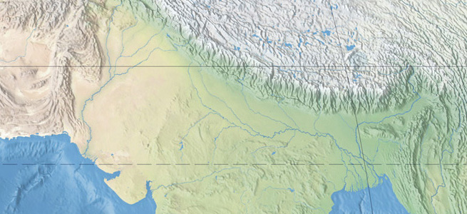
As this map of South Asia and the Himalayas shows, plan oblique relief contains vertical offset. Starting from the datum at sea level, terrestrial mountains project upward toward the top of the map and ocean depths project downward. The graticule is accurate only at sea level.
Labeling physical features on a world map is a subjective exercise. To bring a semblance of order to the project, the author attempted to follow these guidelines:
• The map is intended for an international audience. English is the primary language.
• The GNS database maintained by the U.S. National Geospatial Agency was the main reference for place name spellings of smaller physical features, cities, and seas.
• The density of labels was selected for balanced presentation on a large wall map.
• Labeling physical features took priority over cities and towns, which were included for general orientation and to fill blank places lacking significant physical features.
• Endonyms (Appennino) were favored over exonyms (Apennines) for place names based on Romance and Germanic languages, which are often cognates of familiar English names and easy to identify.
• For other languages, transliterated names of major features (mountain ranges, plateaus, deserts, etc.) received English place name descriptors. For example, Verkhoyansk Khrebet in Russia is labeled on the map as Verkhoyansk Range. Smaller physical features, such as mountains within ranges, have entirely local names.
• Transnational features named in more than one language, for example, the Donau/Duna/Danube River, received conventional English names.
• When two or more countries claim ownership of the same physical feature and use different names for it, the preference was for the country currently in possession of the feature regardless of the circumstances. For example, the southern Kuril Islands that Japan and Russia both claim, and which Russia has occupied since 1945, have Russian names.
• A few notable places have English translations in parentheses, for example, Rub al Khali (Empty Quarter).
• All river names dispense with the word "River" or the abbreviation "R."
• Island names within compact island groups drop the word "Island" or the abbreviation "I."
• Non-English place names have accents and diacritical marks. However, the font used on the map (Adobe Frutiger) lacked a few exotic accents for consonants, which consequently do not appear on the map.
• The map also uses a proprietary font called HFrutiger (Hawaiian Frutiger) that displays a bar instead of an umlaut over vowels to represent the long vowel sound. This is a problem only when you use the editable map labels in Adobe Illustrator format. When you substitute Adobe Frutiger (or any other font) for HFrutiger, umlauts will appear on numerous place names where they shouldn't.
Before releasing the final Physical Map of the World, the author placed a draft with preliminary labels online and invited the public to comment. Many people responded to the invitation, catching spelling errors and offering greatly appreciated advice about map content, most of which was used. Bernhard Jenny, Stefan Räber, Michael Borop, Will Pringle, and Félix Pharand deserve special thanks for their valuable contributions to the map. Any errors that might still exist on it are entirely the responsibility of the author.
Updates
Periodic updates to the Physical Map of the World will occur. Please let me know of misspellings, typos, outdated elevations, questionable transliterations, inconsistencies, and mispositioned labels that you happen to notice. I also would like to hear about notable physical features not shown on the map that should be, if space allows. Many thanks!
Update: September 2015
- Changed Mount McKinley to Denali
- Changed Denali elevation to 6190 meters
- Changed Cape May to Cape Charles