Tom Patterson, U.S. National Park Service
Mike Hermann, University of Maine at Orono
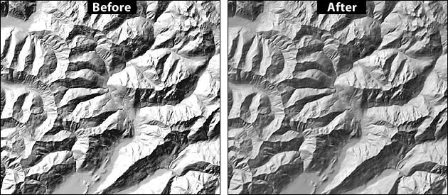
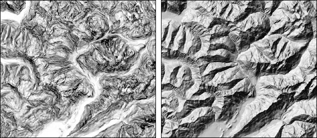
Unenhanced (left) and value-enhanced (right) shaded relief, Olympic Mountains, Washington.
The many shaded relief applications available today generally give users an either/or choice of depicting mountainous landscapes with stark contrast (illustration above, left) or subtle detail. This tutorial introduces a four-step procedure in Adobe Photoshop for enhancing previously rendered shaded relief so that they contain both contrast and detail (illustration above, right).
Those experienced with printing screened images on offset presses know about the tendency to lose data on either end of the tonal scale. Light values (less than 5 percent) usually disappear completely and dark values (greater than 90 percent) fill in and appear solid. A similar problem besets computer-generated shaded relief, particularly in mountainous areas. Steep slopes perpendicular to the illumination direction appear blown out and shadowed slopes become solid black. Although alpine peaks should have sharp contrast in a shaded relief, the loss of topographic detail on peaks compared to adjacent lowlands contradicts Eduard Imhof's aerial perspective effect. According to Imhof, peaks, which are higher and theortetically closer to the eyes of the map reader, should contain relatively more detail than lowlands to enhance the desirable illusion of three-dimensionality.
The amount of apparent topographic detail that appears on a shaded relief is dependent on several interrelated variables, including illumination azimuth (direction), illumination altitude (elevation), vertical exaggeration (Z value, vertical scaling), and the characteristics of the topography itself. Of these variables, vertical exaggeration provides the most consistent method of controlling the amount of tonal information on highlighted and shadowed slopes. By simply decreasing vertical exaggeration from, say, 2 to 0.5, the resulting shaded relief will reveal more subtle detail on these critically important slopes. However, there is a major problem with this approach. Relief generated with low vertical exaggeration usually appears too flat and lacks the graphic drama needed for portraying high mountains.
The solution described below involves producing two shaded relief renderings, one with high contrast (more vertical exaggeration) and the other with subtle detail (less vertical exaggeration), which are merged in Photoshop to produce a final product incorporating the best characteristics of each.
Azimuth = 315 degrees
Altitude = 45 degrees
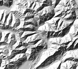
Vertical exaggeration = 1
Save the shaded relief. This image will be the bottom layer in Photoshop upon which the second shaded relief, created next, will be placed.
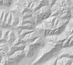
In the example at left, vertical exaggeration = 0.25.
Don't be concerned if the image appears light and flat. You will adjust this in the next step.
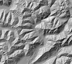
Image/Adjustments/Auto Levels
This image doesn't look too bad, but it still lacks body on the shadowed slopes. This will be corrected in the final step, next.
Slope shading (left) and slope shading merged with shaded relief (right).
A variant of the procedure discussed above uses slope shading (illustration above, left) instead of flat traditional shaded relief for portraying highlight and shadow detail (illustration above, right). The slope shading technique is used by Karel Kriz, University of Vienna, Austria, who is, not coincidently, an avalanche mapping specialist.
Placing the illumination source directly overhead in most shaded relief applications produces continuous tone slope shading (steep slopes are dark, flat slopes are light) when rendered. The azimuth setting is irrelevant when the illumination elevation reaches 90 degrees.
Only a hint of slope shading should be blended with shaded relief to avoid excessively darkening illuminated slopes and interfering with the three-dimensional modeling effects of oblique hill shading.