|
Hal Shelton Revisted: Designing and Producing Natural-Color Maps with Satellite Land Cover Data Tom Patterson, US National Park
Service |
SATELLITE
IMAGES—SEEING THINGS DIFFERENTLY
If the growth of commercial aviation compelled Hal Shelton to paint
natural-color maps, going higher still, the advent of space flight
largely defines the genre today as we settle into the digital era. The
digital solutions offered in this article for making natural-color maps
employ raster land cover data derived from satellite images. But more
than just a technical means to an end, space imagery has forever
changed how people visualize Earth in a realistic context from afar.
The aptly named “Blue Marble” photograph taken by the Apollo 17 crew
heading to the moon in 1972 gave us the first full view of oasis Earth
set against the emptiness of outer space (Figure 6).
Embraced as a symbol of environmental awareness, the “Blue Marble” has
become one of the world’s most recognized images. And as a
natural-color geographical image with pop culture cachet, it is a
rarity.
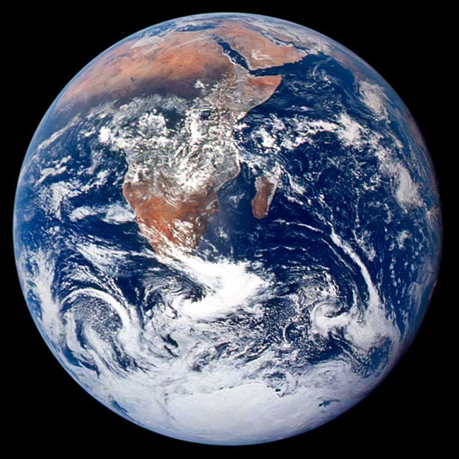
Figure 6. NASA’s
“Blue Marble” photograph shows Earth from a distance of nearly 48,000
kilometers (30,000 miles). Dominated by the Sahara and Kalahari
deserts, Africa is usually the most cloud-free continent. Antarctica is
also visible in this image for the first time (NASA, 2002)
Starting with the launch of Landsat (originally called ERTS—Earth
Resources Technology Satellite) in 1972, remotely sensed images of
Earth in both natural and false colors have become increasingly
abundant with each passing year. The sheer volume of remotely sensed
data collected by a multitude of platforms and sensors is difficult to
comprehend. A Google search in early 2004 using the key words
“satellite images” yields 4,810,000 hits, a coarse, but nevertheless
telling barometer of current popularity. Satellite images have also
replaced maps as the dominant method of depicting natural color on
geospatial products. However, as we shall discuss shortly, quantity and
quality are not always directly related. Off-the-shelf satellite images
are less than ideal for the presentation of natural color on maps.
Intended primarily for scientific, military, and economic use,
satellite images find secondary (and sometimes gratuitous) application
in television and print news, posters, coffee table books, and even
silk screened on coffee mugs and t-shirts. That atlases sometimes use
satellite images and space shots of Earth as cover art points to their
marketing potential. These colorful images attract a buyer’s attention
and deliver a subliminal message that the contents within are
scientifically based, accurate, environmentally concerned, and global
in scope. Perhaps for similar reasons, a satellite image appears on the
cover of the Spring 2002 issue of Cartographic Perspectives. Satellite
images also serve as fine art. The traveling exhibit “Our Earth as Art”
prepared by the Library of Congress, NASA, and USGS is currently
showing in museums and other public venues. The 41 images in the
exhibit (selected from 400,000 taken since 1999) treat audiences to
eye-catching views of Earth from above that appear both surreal and
abstract (Stenger, 2002). Trying to identify the images without reading
the captions is a pleasurable challenge.
Several popular products containing global satellite data in natural
color are available today. “The Living Earth” is one of the older and
better-known commercial images (Figure 7, left).
The original image derives from 1.1-kilometer-resolution AVHRR
(Advanced Very High Resolution Radiometer) data, which NASA began
collecting in 1978. While technically sophisticated when first
introduced, AVHRR products are beginning to show their age. Contrary to
what the name suggests, AVHRR images, judged by contemporary standards,
appear coarse, with too much contrast, and contain tonal variations
seemingly unrelated to land cover and vegetation. The Living Earth,
Inc. now sells updated and improved natural-color images made from
Landsat 5 and 7 data. They also have other promising products under
development.
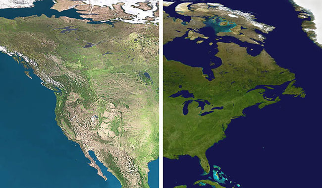
Figure 7.
(left) “The Living Earth.” (right) NASA’s new “Blue Marble.”
Another
notable product is NASA’s new “Blue Marble,” named after the famous
photograph taken by the Apollo 17 crew. The “Blue Marble” derives from
MODIS (Moderate Resolution Imaging Spectro-radiometer) data collected
at 500-meter resolution and distributed to the public at one-kilometer
resolution (Figure 7, right). The “Blue Marble”
portrays arid regions with convincing natural colors but is less
effective in humid regions, which appear as monotonous green tones.
Meteorological interference in the form of snow cover and sea ice in
the polar regions is visible, and areas of shallow water appear to have
been arbitrarily added and appear discordant with rest of the image.
The “Blue Marble” comes pre-composited with shaded relief generated
from GTOPO30 (Global 30-Arc-Second Elevation Data Set) that employs
standard cartographic illumination from the northwest. “The Living
Earth” image discussed previously also contains shaded relief made from
GTOPO30. While the inclusion of shaded relief is a step in the right
direction, its legibility diminishes at scales smaller than 100 percent
of original size, and, with more significant reduction, disappears
entirely. Shaded relief is not nearly as tolerant of reduction as the
underlying color tones found in satellite images. While colors tend to
blend pleasingly into one another when reduced, shaded relief becomes
an unattractive dark smudge. These shortcomings aside, the “Blue
Marble” is a remarkable dataset and is invaluable for making 3D
visualizations and animations. It is also free.
Pictures vs. maps
Based on the popularity of satellite images, many of which appear in
natural color, it would appear that Shelton’s idea about depicting
Earth more realistically has finally taken hold. Well, not quite. The
graphical merging of satellite images and maps, two closely related
geospatial products, has not happened to any great extent. It is a rare
map that uses a satellite image as a raster base in conjunction with
other map information, such as labels, lines, area tones, and point
symbols. In the cartographic context, satellite images are perhaps most
common in atlases as stand-alone thematic insets, decorative
introductory pages, and the aforementioned cover art.
The lack of satellite images used as cartographic backdrops, in the
same manner as shaded relief or hypsometric tints, has a simple
explanation: they are not maps. Remotely sensed images contain traits
that are incompatible with basic cartographic design conventions (Figure 8). Dense, detailed, colorful, and
contrasting, satellite images tend to dominate all other classes of map
information to the point of illegibility. Just as photographic
snapshots often contain undesirable visual elements—a jet contrail in
the sky above the Grand Canyon—satellite images are similarly
afflicted. For example, clear-cut forests in the US Pacific Northwest
appear on satellite images as a mottled pattern that distracts from
everything else.
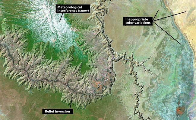
Figure 8. A natural-color Landsat image of the Grand Canyon made from bands 2, 4, and 7. Even the handsomest satellite images contain graphical elements inconsistent with cartographic design goals. Courtesy of the USGS.
Other common problems with satellite images include:
- Meteorological
interference — Because clouds on average cover 64 percent of Earth’s
surface (54 percent of land areas) at any given time, the odds of
finding satellite images completely free of clouds and their shadows
are slim at best (Warren, 1995). Even one small cloud on an image
requires a cartographer to make a difficult choice—an exercise in
cartographic situational ethics. Is it best just to leave the unsightly
blemish on the image, or is it proper to quickly remove it with the
Clone Stamp (Rubber Stamp) tool in Photoshop? After all, who would ever
notice or object? Other meteorological interference encountered on
satellite images includes snow-covered ground, frozen water bodies,
smog, smoke plumes from wildfires, and lowland flooding. Such
undesirable traits plague many of the satellite images available online
for free, which are provided by organizations that monitor the
environment and natural disasters. When using satellite images as
backdrops on maps, boring is better.
- Inappropriate
color variations — It is typical for natural color satellite images to
contain at least some colors that are decidedly unnatural. Despite
appearances, natural-color satellite images are not truly
photorealistic. They typically consist of “bands” of electromagnetic
radiation data from outside the visible spectrum. By inserting these
data, in the form of 8-bit grayscale images, into the red, green, and
blue channels of, say, a TIF image, the results are a concocted scene
with ersatz natural colors—if the mixing and matching of data and
colors are done correctly. The inappropriate color variations flagged
in Figure 8 are in an area of uniform desert shrub. The cause of these
pronounced variations, which are invisible to humans on the ground,
might be differing mineral or moisture content in the exposed
soil—information only of interest to a few people in specialized
fields. Regardless of what the colors represent, they are too prominent
compared to other colors on the image and do not belong on a
general-purpose map.
- Relief
inversion — The southeast lighting (lower right) found on most
high-resolution satellite images when north-oriented causes an optical
illusion known as relief inversion, whereby mountains appear as
valleys, and vice versa. Because being able to tell up from down is so
fundamental, the presence of relief inversion is completely
unacceptable on maps. Removing the embedded shadows that cause relief
inversion on satellite images is technically difficult and yields poor
results, especially in areas of high, sharp relief where shadows are
entirely black. Substituting neutral colors and textures to replace the
shadows, whether by automated means or the Clone Stamp tool in
Photoshop, is an inelegant solution at best. On another tack,
overprinting the satellite image with shaded relief generated from a
DEM (digital elevation model) using standard northwest illumination
only serves to flatten and darken the topography. The shadows, based on
opposing light sources, cancel each other out.
Land
cover—cartographically friendly data
In contrast to satellite images, raster land cover data derived from
satellite images is well suited for making natural-color maps. Raster
land cover data with its classified structure and generalization brings
order to the tonal anarchy of satellite images. The product of
sophisticated image processing techniques and often multiple data
sources, raster land cover data is generally free of the problems that
afflict raw satellite images, such as relief inversion. The result is
reconstituted data that facilitates the production of natural-color
maps. A satellite image distilled into a land cover classification of,
for instance, a dozen categories is merely the raster equivalent of the
polygons etched into zinc plates that guided Shelton’s painting.
Shelton colored his maps with brushes and acrylic paints. We will use
software and pixels. Although the means of production has changed, the
process remains essentially the same today as it was a half century
ago—a cartographic version of painting by the numbers.
Next, we will examine how to make natural color maps from two different
types of raster land cover data. Both are in the public domain and
available online for free. Our primary software for manipulating the
data is Adobe Photoshop. We will begin with National Land Cover Dataset.