The manufacturer's documentation for setting up and using a Wacom tablet is thorough and clear, and the factory default settings generally work well for relief shading, so my comments will be brief:
Choosing a tablet
Wacom sells three tablet lines: 4 x 5" consumer-oriented Graphire tablets, Intuos tablets (ranging in size from 4 x 5" to 12 x 18") aimed at professional users, and the high-end PL Series featuring LCD displays built into the tablet surface. I do not recommend using Graphire Tablets, because of their tiny size, and the PL Series is prohibitively expensive (US$2,200 - $4,000) and provides little additional benefit for shaded relief production beyond that of the less expensive Intuos tablets. For my work I use 6 x 8" and 12 x 18" ArtZ tablets, which were the precursor of the Intuos line. I find the 6 x 8" tablet just as effective for producing shaded relief as its larger sibling, and it costs considerably less and fits nicely in my laptop case.
Heads up!
Perhaps the oddest sensation for new users of Wacom tablets is heads-up drawing. As with a mouse, your eyes are always directed at the computer monitor, never at the tablet itself.
Mapping
Mapping in this instance describes the relationship between the Wacom tablet surface and the computer desktop. Three mapping aspects are available in the Wacom control panel: One-to-One, Proportional, and To Fit. To Fit, which forces the geography of the tablet to match that of the desktop, is best suited for drawing shaded relief, heads-up digitizing of scanned art, and general desktop navigation (the settings I use are shown below). The other aspects are used for distortion-free digitizing of paper maps taped to the surface of the tablet.
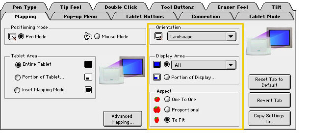
Perhaps the greatest difference between using a mouse and a Wacom stylus is their tracking movements relative to the computer desktop. Unlike the relative position of a mouse, the position of the stylus on a Wacom tablet is mapped predictably to the desktop. For example, raising and moving the stylus to the upper right corner of the tablet also moves the cursor to the upper right corner of the desktop. With 12 x 18" tablets considerable arm motion is required to navigate from one end of the desktop to the other.
Pushing buttons
On the barrel of the stylus is the DuoSwitch, a dual-action button, that can be activated by your index finger while drawing. The behavior of DuoSwitch can be programmed in the Wacom control panel to mimic keyboard commands—handy for quickly switching settings in Photoshop. I have the lower end of the DuoSwitch set as the Option-key, which allows me to instantly toggle between Photoshop's dodge and burn tools, and the upper end activates the X-key for switching between the foreground and background colors (by default white and black) when airbrushing.
Note: The illustrations used here show the palettes from Photoshop 5.5. The palettes in newly released Photoshop 6.0 look considerably different but function similarly.
Resolution
Through hard learned experience, I always work on shaded relief pieces at a resolution equal to or greater than that required for final reproduction. That being said, the de facto standard of 300 dots per inch (dpi) for raster data destined for print production is excessive for most shaded relief. At the NPS, shaded relief is prepared at 200 dpi for final printing with 175 lines per inch (lpi) screens. Ill effects are never encountered despite our blatant disregard for the oft-advised 2:1 relationship between dpi and lpi. We get away with this because shaded relief is comprised mostly of smudgy light tones with few hard edges and fine detail—unlike photographs and illustrations. Higher dpi does not necessarily yield more visible detail, just heftier file sizes. In fact, I once accidentally prepared 72 dpi shaded relief for a printed map of Devils Tower National Monument, Wyoming. It was in print for years without complaint (pixelization emulated the columnar jointing found on upper slopes), before I noticed the low resolution during a routine revision.
More so than other raster images, shaded relief is relatively tolerant of resolution upsampling. I occasionally have need to resample 72 dpi shaded relief to 200 dpi, which is helped afterwards by judicious use of the unsharp mask and median filters.
Color mode
To keep file sizes smaller and graphic variables to a minimum, I prepare all shaded relief in 8-bit grayscale mode, and, if needed, convert the finished piece to RGB or CMYK color afterwards.
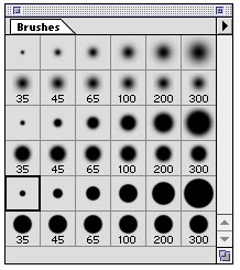
Brushes
Essential advice: In the preferences dialog (Command-K) go to File/Preferences/Display & Cursors and select the show brush size option. This displays brush selections as variably-sized unobtrusive circles rather than the cartoonish icon of whatever tool you are using. Seeing the brush sizes allows you to edit images with greater certainty and precision.
The behavior of Photoshop tools is partially governed by the size, shape, orientation, and hardness of the brushes being used. Photoshop's default round brushes are generally well suited for relief shading. In the course of working on shaded relief, I constantly change brushes, depending on the task at hand. For greater selection, I use my own customized brush set containing different sized circular brushes with soft, medium, and hard edges (shown below).