Tom Patterson
U.S. National Park Service
Division of Publications
Presented at:
International Cartographic Association (ICA)
2002 Mountain Cartography Workshop
Timberline Lodge, Mt. Hood, Oregon
INTRODUCTION
This paper examines the techniques being developed by the U.S. National Park Service (NPS) Division of Publications for designing plan (2D) maps with a faux realistic look. The NPS produces tourist maps for 385 parks in a system spanning a large swath of the Earth’s surface from the Caribbean to Alaska to the South Pacific, and which is visited by nearly 300 million people each year. Many park visitors are inexperienced map readers and non-English speakers. In our ongoing effort to make NPS maps accessible to everyone, the design of NPS maps over time has become less abstract and increasingly realistic, particularly in the depiction of mountainous terrain and natural landscapes (Figure 1). Many of the techniques discussed herein are borrowed from or inspired by 3D mapping (Patterson, 1999). However, the scope of my paper deals exclusively with plan mapping—a format that has received scant attention in the digital era in regard to abstract vs. realistic depiction compared to the 3D world. It is also the format in which the majority of NPS maps will continue to be made.
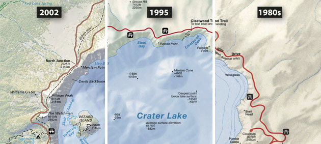
Figure 1. Crater Lake, Oregon. (right to left) NPS maps have become more accurate, detailed, and realistic in appearance over the past two decades, while at the same time retaining their familiar clean design. The 1980s map uses isobaths to show depths in Crater Lake, the only elevation isolines ever to be published on an NPS map. The 1995 map uses hand-drawn bathymetry. The 2002 map, produced entirely from digital sources, combines a forest cover texture with shaded relief.
Why realism?
The move to more realistic map design by the NPS has been gradual and unplanned. Using graphical software applications that allow sophisticated designs to be routinely produced that were previously only imagined, the NPS has found itself inextricably drawn toward using greater realism. Cartography is not alone in this trend. Realism has become ubiquitous in almost every graphical medium today from television to print publishing to multimedia. For example, the graphical user interface (GUI) of Mac OS X, the virtual environment in which I am now immersed, uses soft drop shadows, transparency, pulsing 3D buttons, and a soothing “aqua” desktop to hide its complex Unix underpinnings from the casual computer user (me). The enhanced realism of NPS maps has a similar aim—sparing the park visitor from the off-putting technical aspects of conventional cartography with a map user interface (MUI) that is more user-friendly and that simultaneously delivers relevant and accurate information.
Webster’s dictionary defines realism, in the artistic sense, as: “The picturing in art and literature of people and things as it is thought they really are, without idealizing.” Applying this definition to maps is problematic because all maps (and even many remotely sensed images) are idealized representations of the Earth and are inherently abstract. On the other hand, most of us would agree that some maps appear more realistic and are more intuitively comprehensible than others. For example, a shaded relief map with terrain represented by softly modulated light and shadows appears more realistic than a contour map with a multitude of lines connecting points of equal elevation value. When depicting maps realistically, we are constrained by the finite limits of graphical methods—only so much is possible on a 2D surface—and our pre-conceived ideas of how the Earth appears from above. Geographic, graphic, and perceptual reality are often at odds with one another and must be reconciled by the cartographer in order to design a map with realistic characteristics.
With increased realism, map use becomes more a matter of looking rather than reading. Compared to conventional maps, realistic maps are, undeniably, dumbed down—users have to grapple with fewer abstractions, and intelligence is commonly defined as the ability to think abstractly. However, by avoiding the use of abstract symbolization, realistic maps have the potential to communicate more efficiently to a greater number of users. Think of this as the cartographic implementation of universal design. Users can comprehend realistically portrayed map information relatively effortlessly without explanation (such as text and legends), so they can spend more of their limited time extracting essential information and examining spatial relationships.
Maps designed in a realistic manner also have the potential to be more attractive, even beautiful, compared to their conventional counterparts. This is not a frivolous concern when trying to connect with audiences. In this media-driven age of short attention spans, it is important that we design maps that attract and hold a reader’s attention. People purchase expensive cars based solely on color, vote for telegenic political candidates, and invest substantial sums in corporations that publish slick annual reports. Are map users any less susceptible to the allure of attractive packaging?
Finally, making more realistic NPS maps is a personal interest. Today, for the first time cartographers have the tools and data available to push the limits of map design with relative ease. Using new technology and data to design better maps for park visitors is, for me, irresistible.
LOOKING BACK
Realistic map design is not by any means new to cartography. Among the most spectacular and enduring efforts in cartographic realism are those made by 20th century artist/cartographers.
Artist/cartographers
In the 1950s Hal Shelton, an employee of the USGS and an accomplished fine artist, painted small-scale plan maps of the US to be used by air travelers for general orientation. Shelton’s maps were unique in that they portrayed land cover—forest, agricultural land, and built-up areas—in combination with shaded relief to mimic what passengers would actually see on the ground from an aircraft. On Shelton’s maps land cover was portrayed more prominently than the terrain. Many of Shelton’s original pieces, still under copyright protection, are housed at the US Library of Congress where they may be viewed by appointment only.
Meanwhile, on the other side of the Atlantic, Eduard Imhof’s painted map of Walensee, Switzerland is perhaps the most famous example of early cartographic realism ever produced (Figure 2). Imhof’s piece is noteworthy for its artistic use of strong colors to model topography, which is combined with less dominant land cover. Deep reds are used at higher elevations to give mountain peaks visual loft, blue-gray haze suppresses the lowlands, and cast shadows thrown by steep mountains extend onto the aqua green surface of Walensee. Holding true to the Swiss cartographic preference, cliffs receive considerable textural detail while agricultural fields and forests are depicted with flat color. Drainages and light colored roads are slightly incised into the landscape, as a viewer would expect them to be when viewed from above.
The Walensee map was painted experimentally to showcase the unrestrained application of art in the cartographic context. The resulting masterpiece is on permanent display at the Swiss Alpine Museum in Berne. However, despite the accolades, Imhof was opposed to the idea that his Walensee map would serve as a model for general cartographic design.
According to Imhof
“What is achieved by such painting experiments? When successful, beautiful impressions, natural plan-view landscape pictures result—the pictures that please the hearts of many viewers. But the end result is not a map. Paintings such as these are unable to provide, anywhere and in any respect, the topographic, conceptual and metric information which one expects from a map” (Imhof, 1982).
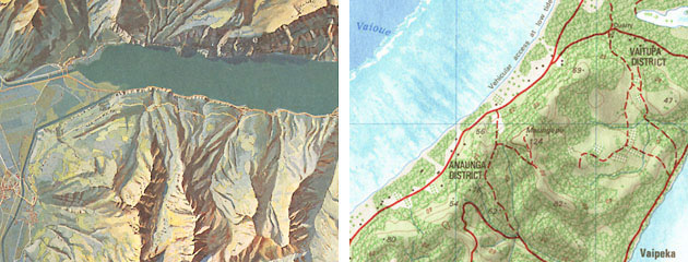
Figure 2. Traditional approaches to cartographic realism:
(left) A much reduced portion of Eduard Imhof’s map of Walensee, Switzerland, painted in 1938. The original measures 200 x 480 cm. Source: Virtual Library Eduard Imhof, Map Collection, Swiss Federal Institute of Technology (ETH). www.maps.ethz.ch/imhof_engl.html
(right) Aitutaki, Cook Islands. A colorized aerial photograph depicts the coral reef. Source: New Zealand Department of Survey and Land Information. Crown copyright reserved.
www.linz.govt.nz/services/topo-hydro/pages/topo/topographicmaps/topo-downloads.html
Aerial photograph maps
While Shelton and Imhof were exploring map realism via art, others were pursuing a more technical approach using aerial photographs (and later satellite images). A snapshot of the Earth from above, aerial photographs are the ultimate in geo-realism providing cartographers with a means to deliver pure and uncensored geographic information to the reader (Keller, 2000). And aerial photograph maps are easy to make. Just place some type and lines on rectified aerial photography, such as a USGS Digital Orthophoto Quadrangle (DOQ), and the map is finished, and you can go to lunch. Despite these advantages, outside of the engineering, surveying, and scientific fields, aerial photograph maps have not caught on for general cartographic use. Aerial photographs contain inherent flaws, particularly in mountainous areas, that translate poorly to the graphical format of maps. Flaws include:
• Relief inversion - Most aerial photographs and satellite images are taken in mid morning when the atmosphere is clear and when sunlight originates from the lower right or southeast (in the northern hemisphere). Shaded relief illuminated from this direction is highly susceptible to relief inversion, an optical illusion in which mountains and valleys appear to be inverted. Although it is possible to adjust embedded shadowing in aerial photographs to counter relief inversion in relatively flat areas (Rudnicki, 2000), the technique is not applicable in high mountains.
• Cast shadows - Shadows cast by high, steep terrain often obscure important information on adjacent slopes and flat areas. They also cause drainages to appear misregistered with terrain and can disfigure an image with unsightly dark blotches. Cast shadows are impossible to remove when their density approaches 100 percent.
• Information overload - Aerial photographs show raw, unfiltered data in all its confusing glory. Untrained readers may find the minute detail to be fascinating, but few actually understand what they are seeing.
• Inappropriate information - Do we really need to see parking lots, power lines, construction sites, and Christo art?
• Invisible information - Small buildings, trails and streams often cannot be seen through dense forest canopies. Clouds, which tend to persist over mountainous regions, and their shadows obscure the ground below.
• No visual hierarchy - From above, a park visitor center and a nearby sewage treatment facility might appear equally significant.
• Temporal sensitivity - For better or worse, aerial photographs show us a single moment in time. By the time the map is made, an image taken of a farm field could have been replaced with suburban homes, a glacier could have melted, or a winter-bare deciduous forest may be in leaf.
Notwithstanding these shortcomings, aerial photographs have been used to produce realistic maps. Most innovative, perhaps, are the South Pacific island maps, including Aitutaki, Cook Islands, produced by the New Zealand Department of Survey and Land Information during the 1970s. On the Aitutaki map, terrestrial areas are shown in a competent and conventional cartographic manner. However, the depiction of water is unique (Figure 2). Using a colorized aerial photograph to show areas below sea level only, coral reefs, shoals, and surf breaks are shown with detail and clarity that can not be achieved with conventional cartographic methods. Relief inversion and cast shadows are not a problem because coral reefs are essentially flat and covered by a layer of shallow water that diffuses otherwise troublesome southeast illumination.
By selectively integrating conventional cartography and aerial photography, the Aitutaki map points to the approach used by the NPS for realistic mapping.
NPS APPROACH
The NPS uses a multi-disciplinary approach for bringing realism to its maps. The artistic inspiration of Shelton and Imhof can be found in our products, as can bits and pieces of aerial photographs and satellite images, DEMs, and vector geodata, all of which are combined selectively and with subtlety in Adobe Photoshop and other graphical software applications (Figure 3). Realistically designed NPS maps are not photorealistic. Instead, they are a stylized view of the Earth as seen through a powerful graphical lens, which attempts to show landscapes not as they actually are but how readers might expect or desire them to look.
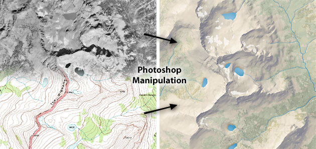
Figure 3. The Wigwams, Grand Teton National Park, Wyoming. Combining and manipulating a USGS DOQ (left top) and DLG and DEM data (left bottom) in Adobe Photoshop results in a more realistic map (right).
The making of realistic NPS maps is an opportunistic enterprise used only when special conditions are met. The availability of high quality data is the most critical requirement. A missing piece of key information can prevent the transformation to realism from happening. Time and money are also important considerations, because realistic maps are elaborate productions that take considerably longer to complete than their conventional counterparts. Finally, one must identify a NPS map situation that would benefit significantly from realistic design treatment—not every NPS map is a suitable candidate, particularly those in urban areas or maps that emphasize property ownership. But, when excellent data is at hand, schedules are open, and a suitable project identified, realistic map design is an option to consider.
On those NPS maps that receive realistic design treatment, some classes of map information are more suitable for realistic depiction than others. In general, physical landscape features are highly suited, cultural features less so, and explanatory elements not at all (Figure 4).
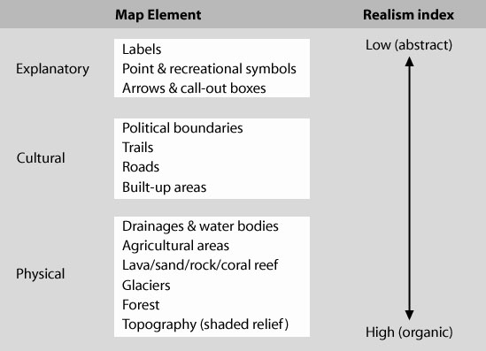
Figure 4. On NPS maps, physical features are more apt to be portrayed realistically than cultural and explanatory map elements.
To design realistic maps, the NPS attempts to consolidate all physical features—shaded relief, land cover, drainages, etc. as a single graphical entity. By grouping physical features together on one level, the base, the visual hierarchy of the entire map is simplified, which allows cultural and explanatory information to be seen more legibly above. Although physical features occupy the same visual level, they can be made to appear distinct from one another by using graphical special effects.
Four rules for realistic map design:
1) Remove lines - As shown by their use in prehistoric cave art and children’s drawings, lines are the most rudimentary form of graphical expression. They are also much loved and over used by map makers. Strong in form and visually distracting, lines are extremely rare in the natural world. Take them off your map wherever possible.
2) Rasterize - Vectors and realism are incompatible. Rasterizing vector lines and fills in Photoshop makes them less artificial and more organic. Rasterizing also sets the stage for later exotic filter manipulations that can be applied only to pixels (Figure 5).
3) Modulate tones - Just as lines are rare in nature, so to are perfectly flat area tones. Seemingly flat surfaces such as water bodies, ice fields, and deserts contain subtle tonal variations that need to be emphasized.
4) Texturize - Graphical noise and embossed textures give selected area tones, such as cliffs and forests and even rasterized lines, a tactile appearance that more closely mimics nature (Figure 6).
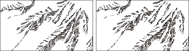
Figure 5. Mt. Rainier National Park, Washington. (left) Hand-drawn rock hachures. (right) The hachures are rasterized and lightly filtered in Photoshop to appear more rock like.
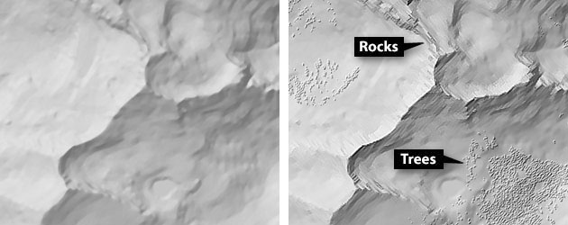
Figure 6. Grand Teton National Park, Wyoming. (left) Conventional shaded relief. (right) Land cover textures embossed onto the shaded relief surface.
Applying the rules mentioned above to the design of realistic maps requires utmost restraint. Not only is the philosophy for designing realistic maps somewhat different from that of conventional cartography, so too are the production techniques used to apply these designs. Although merging physical landscape features can yield spectacularly realistic results, the potential for a disaster is also high—the cartographer must put more physical information than ever before on a rasterized base map using unfamiliar techniques. A light touch is required. For example, applying an embossed forest texture on a map any heavier than a mere hint creates distracting noise that obliterates shaded relief and other raster information below (Figure 6). To help see whether the merged physical elements on a realistic map are in graphical balance, try viewing the map on screen at large and small scales. A map that may look perfectly legible at any given spot at 100 percent scale may not work as well when viewed in its entirety at thumbnail size, and vice versa. The objective is to create a map that appears realistic and legible at both macro and micro scales.
The design of realistic maps depends heavily on a reader’s observations and perceptions of natural phenomena, particularly when choosing color. Even USGS topographic maps, which are quintessentially conventional, use earth brown for printing contour lines, light green for forests, and blue for water. Determining the degree of literalness in which to portray natural phenomena on a map is an imprecise art. A flexible design approach is essential for success. The cartographer must be mindful that the unrestrained pursuit of realism can yield unsatisfactory results, and that even realistically designed maps sometimes need to resort to conventional solutions out of graphical necessity. For example, to an observer deep in the Grand Canyon, the silt-laden Colorado River is the same color as the terra cotta landscape through which it flows. Showing the Colorado River and Grand Canyon topography in their natural colors on a map would camouflage the river from readers. In a pragmatic nod to cartographic convention, the compromise would be to depict the river as an impure shade of blue.
TECHNIQUES
This section briefly describes specific techniques used by the NPS for making more realistic maps.
Aquafication
The depiction of hydrography on conventional maps is usually a perfunctory exercise. Drainages and shorelines are drawn as vectors shown as uniformly thin blue (or cyan) lines, and water bodies are filled with a flat tint of the same color. Hydrography produced in such a workmanlike manner appears mechanical and is discordant with other physical elements on the map.
By contrast, on realistically designed maps hydrography is given a softer, more natural appearance. The idea is for the hydrography to become a harmonious part of the landscape (Figure 7). The key to achieving aquafication is to remember that lines are seldom found in nature—therefore, all casings are removed from oceans, lakes, and double-line rivers. Drainages are made to appear more natural by tapering widths based on their relative size and direction of flow—a tedious technique that is a throwback to our pen and ink cartographic forebears. However, it is relatively easy to taper drainages in a program like Adobe Illustrator using custom brushes. A library of custom brushes can be built to represent various thin-to-thick tapering progressions, which are easily applied to stream vectors (Nelson, 1999).
In the aquafication process, all hydrographic features, including water bodies and tapered drainages, should be assigned the same color (avoid using pure cyan) and rasterized as a single layer in Photoshop. Once in Photoshop, subtle adjustments can be applied to give the hydrography a more realistic appearance. By adjusting the opacity, blending mode, and color of the layer, hydrography can be given just the right amount of prominence compared to other physical landscape elements. As a final touch, sun glints (a form of modulation) can be added to water bodies and rivers by applying light tone with the airbrush tool and a big soft brush.
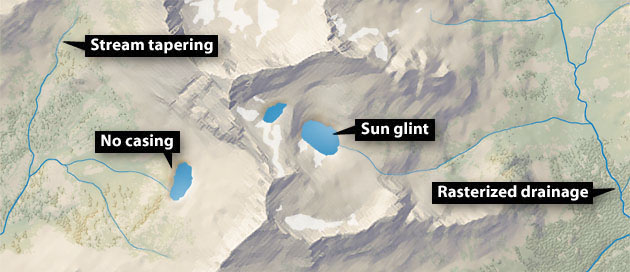
Figure 7. Grand Teton National Park. Hydrography harmoniously integrated into the cartographic landscape.
As a general rule, water bodies are blank space on maps. They are a convenient dumping ground for legends, text notes, and photographs that pertain to terrestrial areas, usually the prime focus of the map. The secondary status of water bodies on maps, and their constantly changing appearance in nature, also provides cartographers with a blank canvas for applying realistic special effects not applicable to terrestrial areas where conflicts with primary information are a concern. Special effects on water surfaces are more than artistic embellishments. They can improve map communication. For example, a sun glint strategically placed near a shoreline park visitor center can be used to subconsciously draw the reader’s attention to that area. Other special effects can imply environmental phenomena. By showing a wave pattern only on the choppier windward shore, the leeward and windward shores of a tropical island can be differentiated (Figure 8).
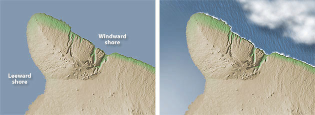
Figure 8. Kohala, Hawaii: (left) The Pacific Ocean depicted as flat blue. (right) Waves, breaking surf, and a leeward sun glint suggest prevailing northeast trade winds without having to use labels. Clouds are optional.
More precise mapping is possible with artistic embellishments on water. For example, a partially submerged reef can be mapped, albeit indirectly, by showing its effect on water—breaking surf—by transferring an image of the surf from a registered aerial photograph. The NPS has used a similar technique to map rapids on the Potomac River at Great Falls Park, Virginia.
Finally, a discussion of aquafication would not be complete without mentioning the portrayal of ocean floors and lake bottoms with shaded relief and continuous tone depth tints (Figures 1 and 12). Popularized by the ocean floor maps published by National Geographic, this style of bathymetric depiction is being used increasingly on NPS maps to show connectivity between underwater and terrestrial environments.
Texture substitution
The textures found on aerial photographs contain a wealth of rich visual cues for differentiating land cover. Forest canopies often appear hummocky, rocky areas can be rough and fractured, and agricultural fields appear as a patchwork of mottled tones. However, except for some water features, transferring these textures directly to a map is not feasible because of the inherent flaws in aerial photographs discussed earlier.
A technique known as texture substitution can be used to partially circumvent this problem. Here’s how it works. Using an aerial photograph or satellite image (registered to a base map), land cover is carefully delineated as Photoshop selections with pixel-level precision. These selections are then transferred to the base map, where they are filled with generic land cover textures cloned from the aerial photograph, or even from other photographs (Figure 9). The result is a reconstituted final product that selectively brings the best traits of aerial photographs—their often eye-catching beauty, realism, rich textures, and tiny details that readers find so fascinating—to the familiar and readable format of a map. Maps created with texture substitution appear more like a picture of a detailed physical model than an aerial photograph. On aerial photographs textures begin coalescing at scales smaller than 1:50,000 (Imhof, 1982). This problem can be solved by substituting large-scale textures onto a small-scale map. The results of this procedure look surprisingly plausible and natural.
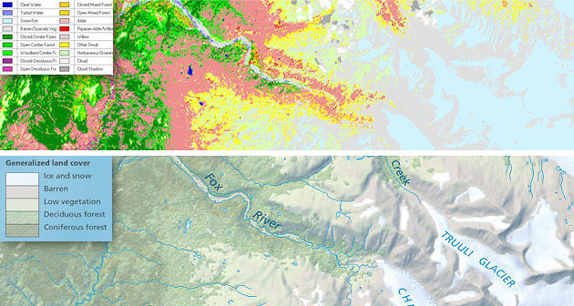
Figure 9. Texture substitution: Kenai Fjords National Park, Alaska. (top) Detailed land cover generated in ERDAS from SPOT and Landsat satellite images. (bottom) The same land cover reduced from 18 to 5 categories on the park visitor map. The substituted forest texture was cloned from an aerial photograph taken near San Francisco, California.
The selection of appropriate generic textures to substitute is a critical consideration for preventing a map from turning into a grossly inaccurate caricature. Substituted textures must accurately characterize the land cover being depicted, with just enough variability to look authentic. However—and this is extremely important—the variability must also be small and inconsequential in nature so it doesn't mislead readers with false information. Substituted textures should be completely avoided on very large-scale maps, because at these scales the generalized textures would be a blatantly incorrect replacement for actual detail.
Substituted textures look most natural when used inside complex land cover selections as opposed to generalized selections (Figure 9). Alternating textured/nontextured areas produces a tessellation that compliments the texture pattern as a whole. With some classes of land cover, such as forests, a slight amount of 3D embossment (known as bump mapping in 3D applications) applied to forest polygons themselves suggests a forest edge rising above adjacent non-forested areas (Nighbert, 2001). The orientation of the tiny highlights and shadows on an embossed 3D texture must synchronize with the illumination and shadows on the shaded relief—usually from an assumed light source in the upper left. In general, textures should be used sparingly on a map. Keep in mind that not every type of land cover warrants or is suitable for texturized portrayal. On NPS maps land cover textures are mostly used to depict forests, glaciers, lava flows, and rocky peaks. Other classes of land cover are left untextured to give the reader’s eyes a place to rest.
When aerial photograph textures are not suitable for texture substitution, manual touchups and synthetic texturing (both done in Photoshop) are the options of last resort. If these techniques must be used they should be printed lightly and applied to polymorphous features, such as sand dunes or glaciers, where cartographic accuracy is elusive under the best of circumstances (Figure 10).
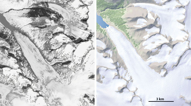
Figure 10. (left) A Landsat image of Dinglestadt Glacier, Kenai Fjords National Park, Alaska in late summer. Glaciers in nature can be untidy. (right) A manually enhanced depiction of the same area without medial and lateral moraines and blotchy patches of dirt, snow, and ice. The glacier snout has been given a domed appearance and a texture to suggest disintegrating ice. Smooth virgin ice and snow is shown at higher elevations.
Illuminated relief
The illuminated relief technique enhances shaded relief combined with land cover textures. Normally, combining shaded relief and land cover textures on a map involves graphical compromise. Together these elements are not as effective as when they stand alone, especially shaded relief, which has a wispier appearance compared to land cover textures.
When illuminated relief is used, supplemental illumination and shadowing enhance topographic modeling by also lightening and darkening land cover textures. The technique uses adjustment layers and alpha channels to manipulate the hue, saturation, and brightness of selected areas on a shaded relief map. By using multiple adjustment layers that build upon one another, complimentary illumination and shadow colors can be made gradually more intense at higher elevations to suggest alpenglow (Figure 11). Conversely, substituting gray-blue for dark gray in upper elevation shadows diminishes the visual weight of the entire map (a good thing when additional information needs to be added) without degrading the topographic form (Patterson, 2001). Transparent pastel colors are preferred. When choosing a palette to depict illuminated relief (as well as other map elements), the NPS seeks fault-tolerant colors that can withstand the vagaries of offset printing, conversion between CMYK and RGB color modes, and screen viewing on multiple computer platforms.
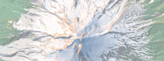
Figure 11. Illuminated relief: Mt. Hood, Oregon. Warm illumination and cool shadow tones strengthen the sense of three dimensionality in the topography despite the presence of prominent snow and forest textures.
Outside land muting
Just as the natural and cultural worlds co-exist, so too must park and non-park lands on realistically designed NPS maps. Differentiating these areas by using figure-ground contrast is a simple matter of applying lightening or desaturation to non-park lands with an adjustment layer in Photoshop (Figure 12). Using a transparent green boundary ribbon accentuates the boundary.
More problematic, many National Parks are surrounded by, or contain within their boundaries, an intricate quilt of public and private lands and administrative zones, such as wilderness areas, that need to be mapped. Depicting additional property ownership on a realistic map is a challenge, which sometimes cannot be resolved satisfactorily. The flat colors usually used to represent property holdings conflict with shaded relief and land cover textures shown below. However, providing that the quantity and complexity of property ownership is not overwhelming, using a combination of color-coordinated lines, transparent boundary ribbons, and labels is the least damaging method for depicting property and realistic landscapes together.
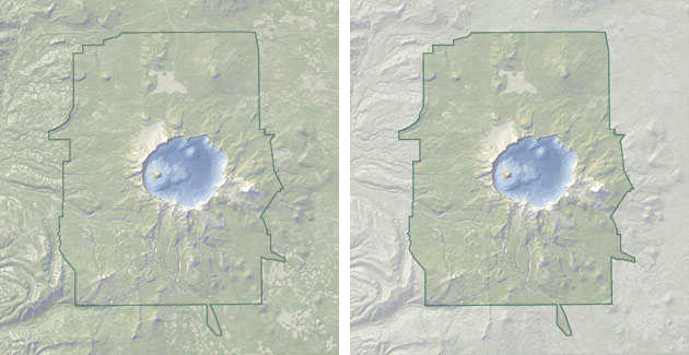
Figure 12. Crater Lake National Park, Oregon. (left) Land inside and outside the park boundary portrayed the same. (right) Lightening the outside land in Photoshop enhances park/non-park figure-ground and hides clear-cut logging (the light gray patches)—if only nature could be healed as easily.
CONCLUSION
Writing this paper has provided an opportunity to reflect on the design trends that are changing the look of NPS maps. Until recently, the design of NPS maps has been constrained by half-century-old design values and production technology. Digital technology has brought unprecedented opportunities to refine the design of NPS maps, moving away from abstraction to a more realistic appearance. Whether this design transformation will significantly improve a map user’s park experience remains to be seen, although the anecdotal evidence is encouraging. At the few parks where realistically designed maps are available, map use appears to be dramatically up—people are probably drawn to the more attractive packaging. If map users also come away with a better understanding and appreciation of the parks, the realistic map design effort will be judged a success.
GALLERY
Take a closer look at NPS maps that use the realistic design techniques discussed in this paper.
Kenai Fjords (1.5MB)
Wilsons Creek (384KB)
Crater Lake (860KB)
Grand Teton (184KB)
REFERENCES
Imhof, Eduard. 1982. Cartographic Relief Presentation. de Gruyter, Berlin, New York, H.J. Steward (edited by), 389 p.
Keller, C. Peter and O’Connell, Ian J., 2000. Expert Land Evaluation Using Maps vs. Orthophotomaps (oral presentation). NACIS XX. Knoxville, Tennessee.
Nelson, David. 1999. Using Adobe Illustrator’s Brushes for Cartography (demonstration). NACIS XlX. Williamsburg, Virginia.
Nighbert, Jeffery S., 2000. Using Remote Sensing Imagery to Texturize Layer Tinted Relief. Cartographic Perspectives. No. 36. pp 94-98.
Patterson, Tom. 1999. Designing 3D Landscapes. Multimedia Cartography. Springer-Verlag, Berlin, W. Cartwright, G. Gartner, M. Peterson (edited by), pp. 217-229.
Patterson, Tom. 2001. See the light: How to make illuminated shaded relief in Photoshop 6.0. www.nps.gov/carto/silvretta/illumination/index.html
Rudnicki, Waldemar. 2000. The New Approach to the Relief Shading Applied to Satellite Image Maps. Proceedings of the Second Symposium of the Commission on Mountain Cartography of the International Cartographic Association. Dresden University of Technology. Dresden. M.F. Buchroithner (edited by), pp. 105-106.