Tom Patterson, U.S. National Park Service
Update: For more information on cross-blended hypsometric tints and to download a wall map of the coterminous United States made with this techique visit: www.shadedrelief.com/physical
Introduction
Hypsometric tints--cartographic jargon for colors representing elevation--bring to maps the pleasing greens, beiges, yellows, reds, and whites used to depict elevation zones from lowlands to highlands. They take the form of stepped intervals, similar to a layer cake, or continuous-tone color ramps, sometimes called gradient tints. Although most map users have never heard of hypsometric tints, chances are good that they have seen and admired maps designed with them in atlases, on classroom walls, or decorating homes and offices. Handsome Raven Maps are perhaps the best-known example of this genre in the United States.
Developed decades ago and now conventionalized, hypsometric tints excel at bringing visual order to complex topography. However, these colors can be misleading because of their tendency to be confused with vegetation and land cover. On a map with hypsometric tints, readers naturally interpret dark green as forest, beige and red as desert, and yellow as grasslands rather than as elevation zones. People observe environmental colors every day. With the exception of white associated with snow-covered mountains, however, elevation is a color-neutral abstraction.
Aiming to improve a venerable cartographic design style, this paper introduces a technique in Adobe Photoshop for systematically creating hypsometric tints that mimic generalized environmental colors (Figure 1). Small-scale maps are the intended use.
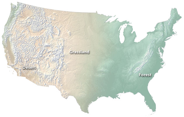
Figure 1. The cross-blended hypsometric tints on this physical map of the U.S. depict desert, forest, and transitional grassland environments more naturally than conventional hypsometric tints (see Fig. 2 for comparison).
Discussion
Seeking to differentiate elevation zones clearly and/or to design attractive maps that are more marketable, cartographers have designed countless hypsometric color schemes over the years. They generally employ lighter values at higher elevations and darker values at lower elevations. For graphical reinforcement, warm yellows and reds, which appear to rise off the page, are preferred for highlands. Blue-green is the overwhelming color of choice for lowlands (Imhof, 1982).
Although no better color exists than blue-green for graphically recessing lowlands on maps, it is problematic because of its strong association with well-watered climates and vegetation. For example, Death Valley, California is not forested. Neither are the shores of the Persian Gulf or the Taklimakan Shamo (Tarim Basin), China. These extremely arid lowlands support only the sparsest vegetation, if any at all.
Hypsometric tints for higher elevations continue to mislead map-readers about climate and natural vegetation. It is at higher elevations that the yellows, beiges, and reds appear. However, highlands that rise above arid lowlands throughout much of the world receive orographic precipitation and support significantly greater biomass--just where one would expect to see green on a map instead of, say, red. The vast montane forests of the western United States and the jungly volcanic highlands of east Africa that rise above the thorny savannah are examples of this phenomenon.
Misleading associations between elevation colors and natural vegetation afflict even the classic hypsometric tints developed by Eduard Imhof and Karl Peuker (Figure 2). How many casual map-readers, looking at Peuker's use of warm red at upper elevations, would realize that Yellowstone National Park is most definitely not a desert? Had Imhof and Peuker lived in the western United States rather than the green foothills of the Alps, perhaps their color choices would have been different. Much of the terrestrial world is arid or semi-arid.
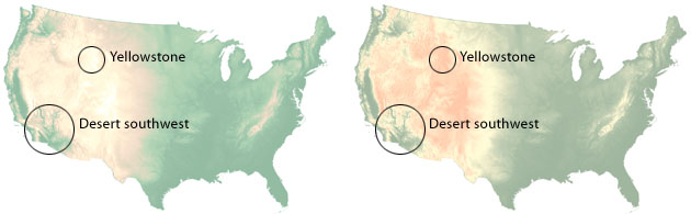
Figure 2. Conventional elevation colors based on Imhof (left) and Peuker (right). Despite appearances, lowlands in the desert southwest receive less than 5 inches (127 millimeters) of annual precipitation, and the Yellowstone region supports dense forest.
Redesigning maps to match readers’ intuitive assumptions is more practical in the short term than educating millions of people on the finer points of map reading. Because readers often mistakenly interpret hypsometric tints as natural vegetation or land cover, cartographers may have little choice but to merge these classes of information. Perhaps the greatest need for combining hypsographic and environmental colors together on a map is on small-scale maps to be used by general audiences, such as airline route maps. For these types of maps, knowing whether or not the land below is lushly vegetated is equally as important as knowing whether plateau A is 250 meters higher than plateau B. The hand-painted environmental maps published by National Geographic Society and others fill a similar niche, although they lack hypsography.
Cartographers often assume that all information on a map serves a lofty purpose--communicating information--but this is not always true. Popular magazines sometimes use “designer” maps containing background art comprised of whimsical colors and textures. The texture of crumpled paper bags has been used as a substitute for shaded relief. Perceiving traditional maps as being too staid, art directors arbitrarily chose such whimsy. To counter these poor decisions, cartographers must offer map alternatives that are both designerly and geographically relevant. The technique described below, I believe, provides cartographers with a path toward accomplishing this goal.
Technique
Using Adobe Photoshop, it is relatively easy to design hypsographic tints with colors that simulate generalized natural land cover. Removing green from desert lowlands eliminates the most troublesome environmental misperceptions. Turning the desert brown in a systematic fashion works wonders. Forests will no longer cover the hot briny floor of Death Valley.
Cross-blended hypsometric tints are key to this technique, which requires two continuous-tone color ramps. One ramp represents arid coloration and the other humid coloration. Both are made from duplicated copies of the same Digital Elevation Model (DEM). Placing the two ramps on separate layers in Photoshop and then filling their respective layer masks with diffuse tones blends the differently colored DEMs (Figure 3). For consistent blending it is critical that the layer masks be inverted copies of each other.
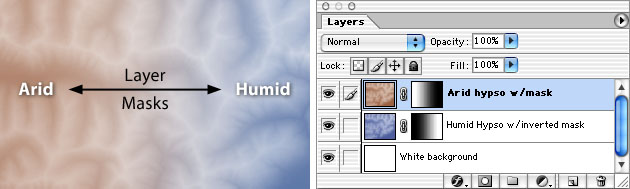
Figure 3. (left) Hypothetical arid and humid elevation colors applied to a DEM. (right) The arrangement of Photoshop layers and masks.
For this exercise I chose a DEM of the coterminous United States in the Albers Conic projection. My intimate familiarity with the topography and natural vegetation made verifying its accuracy easier as I worked through the technique.
An isoline map showing annual United States precipitation (Daly, 2003), also in the Albers projection and in registration with the DEM, served as the mask between arid and humid regions. In the mid-latitude United States, the zone between the 15- and 30-inch (381- and 762- millimeter) isohyets generally separates arid and humid environments (Figure 4). Areas receiving 30 or more inches of annual precipitation support forest cover. Trees are scarce in areas receiving less than 15 inches. Using the precipitation map mask, transition zones falling between the 15- and 30-inch isohyets, such as the Great Plains, were blended from semi-arid grasslands in the west gradually becoming greener to the east. By tonally-choking the precipitation mask (all arid areas became solid white and all humid areas became black), the hypsometric coloration of regions of extreme dryness or wetness was not emphasized. For example, the rain-drenched Gulf Coast and the moderately watered Lower Peninsula of Michigan, both classified as humid, received identical treatment.
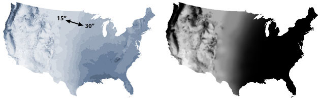
Figure 4. (left) Annual precipitation map of the United States. (right) The precipitation map converted to grayscale mode, blurred, and tonally choked for use as a layer mask in Photoshop.
A derivative of Imhof’s hypsometric tints (see Figure 2, left) served for depicting the humid eastern United States and Pacific Northwest. Modifications included adding magenta in the bottom-most green and substituting a touch of cyan for magenta at mid elevations--to give mountain forests in the Rockies a faint hint of green. Because the elevation of the eastern United States, where humid colors dominate, is so low, color breaks concentrate at the lower end of the hypsometric scale. Higher in elevation, the humid color ramp graduates to white to highlight the summits of the moister western mountains. When in doubt, white is a most appropriate color for portraying mountains. Throughout the world wherever snow falls, regardless of the culture or language, “white” and “snow” are far and away the most common descriptive terms applied to mountains (Julyan, 1984).
The arid hypsometric colors are a warmer complement to the humid colors. The upper end of the scale, which is white, perfectly matches that of the humid. At the lowest elevations, however, reddish brown substitutes for blue-green. Choosing the right brown was tricky and somewhat subjective--using too much red tended to elevate the lowlands and too much black or dark brown made the desert lowlands muddy and unattractive. Looked at from the standpoint of value, the darkest arid lowlands are almost half the value of the darkest humid lowlands (15 versus 27 percent). Light yellow-gold at mid elevations gave dry grassland coloration to the high plains. Because of the high average elevation of the western United States where the arid colors are exclusively found, hypsometric color breaks here are comparatively higher in elevation than those used for the eastern United States.
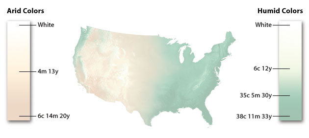
Figure 5. Simple dark-to-light (low-to-high) hypsometric color ramps represent arid (left) and humid (right) regions. The cross-blended final map (middle).
This paper demonstrates the applicability of cross-blended hypsometric tints for representing environmental colors. Admittedly, the technique involves compromises. Substituting a light brown for dark green in desert lowlands is less effective for strictly showing relative elevation differences. The technique yields only generalized environmental colors. For example, showing coniferous mountain forests in the western United States is still a problem because hypsometric lightening is necessary at higher elevations and this diminishes the value of green. National Geographic Society’s painted environmental maps offer far more detail--but one must be willing to pay the steep price for manual production. By contrast, maps made from cross-blended hypsometric tints are easy to make. Small-scale DEMs are available for all continents, and the precipitation maps used for masking are readily obtained.
Not intended for use as stand-alone background art, cross-blended hypsometric tints are most effective on maps when combined with shaded relief, which further compromises hypsometric color fidelity--but for the greater graphical good. Compared to conventional shaded relief that tends to excessively darken the cross-blended hypsometric tints below, the soft light and shadows of illuminated shaded relief (used in Figure 1) work better. (Patterson, 2001).
The effectiveness of the technique in geographic areas other than the United States has yet to be tested. While I suspect that the technique would work well for a physically varied continent such as Asia, it may be less effective for continents with relative physical homogeneity. Arid Australia would be a worthy test.
While the technique described here uses dual blended hypsometric tints, using additional hypsometric tints might yield beneficial results. For example, a third hypsometric color ramp comprised of warm beiges might be a better approach for depicting semi-arid lands (Toth, 2002). Similarly, gray-blue tints modulated by an isotherm mask (transitioning at the critical 10-degree centigrade isotherm for July) could portray cold arctic lands. Given the cross-blended hypsometric tint technique, plus average Photoshop skills and geographic knowledge, the routine design and production of elaborate environmental maps is now within reach of most cartographers.
References
Daily, Christopher and Taylor, George. 2003. Oregon Climate Service. (website) www.wrcc.dri.edu/pcpn/us_precip.gif
Imhof, Eduard. 1982. Cartographic Relief Presentation. de Gruyter, Berlin, New York, H.J. Steward (edited by).
Julyan, Robert H. 1984. Mountain Names. The Mountaineers, Seattle.
Patterson, Tom. 2001. See the Light: How to Make Illuminated Shaded Relief in Photoshop 6.0. (website) www.nps.gov/carto/silvretta/illumination/index.html
Tait, Alex. 2001. Shaded Relief Production and Presentation Using Photoshop 6.0. NACIS Practical Cartography Day (demonstration). NACIS XXI. Portland, Oregon.
Toth, Tibor. 2002. (personal communication).